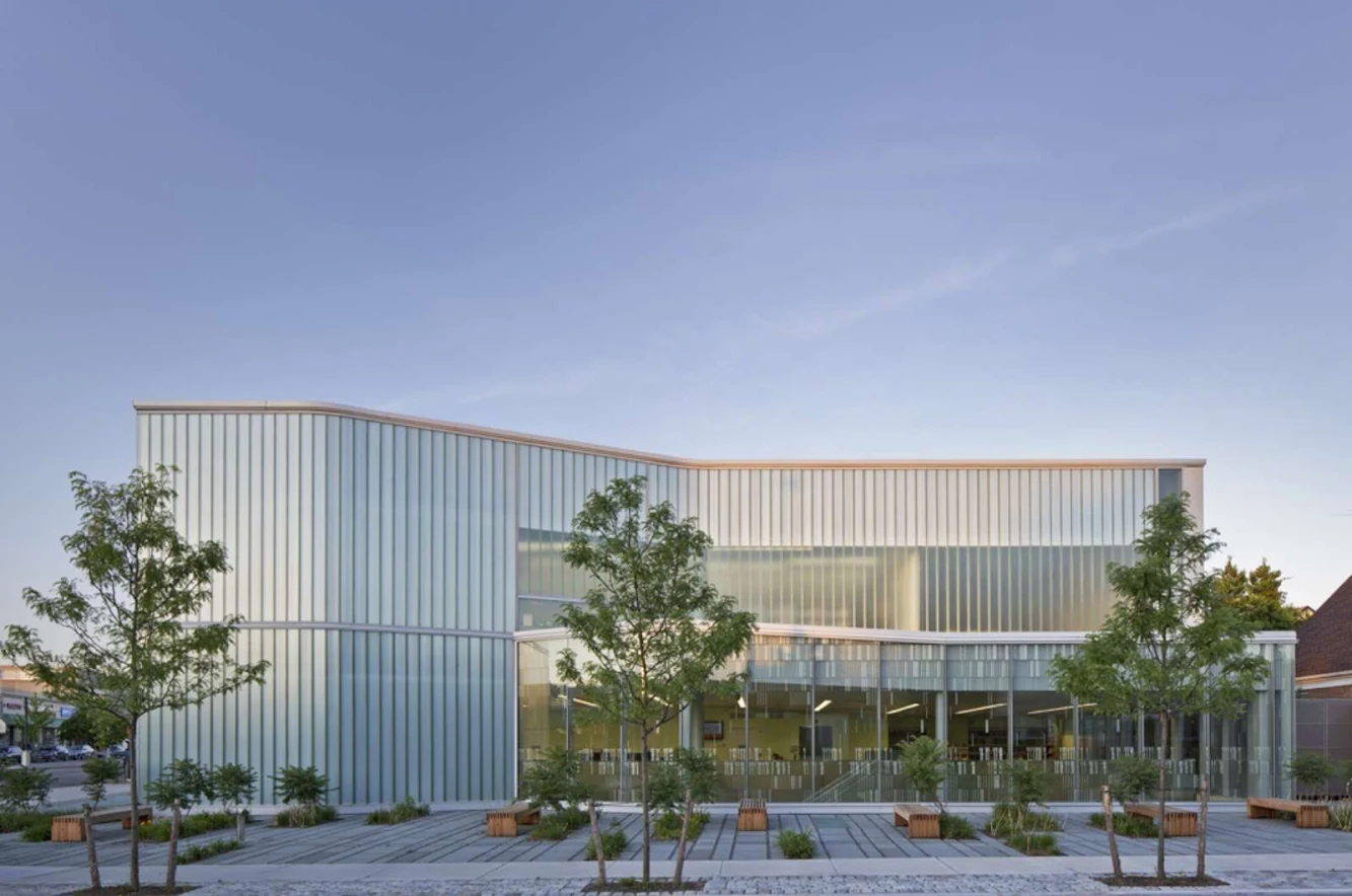
Glen Oaks Branch Library replaces an existing one story facility with a new 18,000 sf high performance, Leed certified building located at the juncture of a low scale commercial/institutional area with a suburban residential neighborhood. the program includes reading rooms on all three levels, a cybercenter, and community meeting spaces.

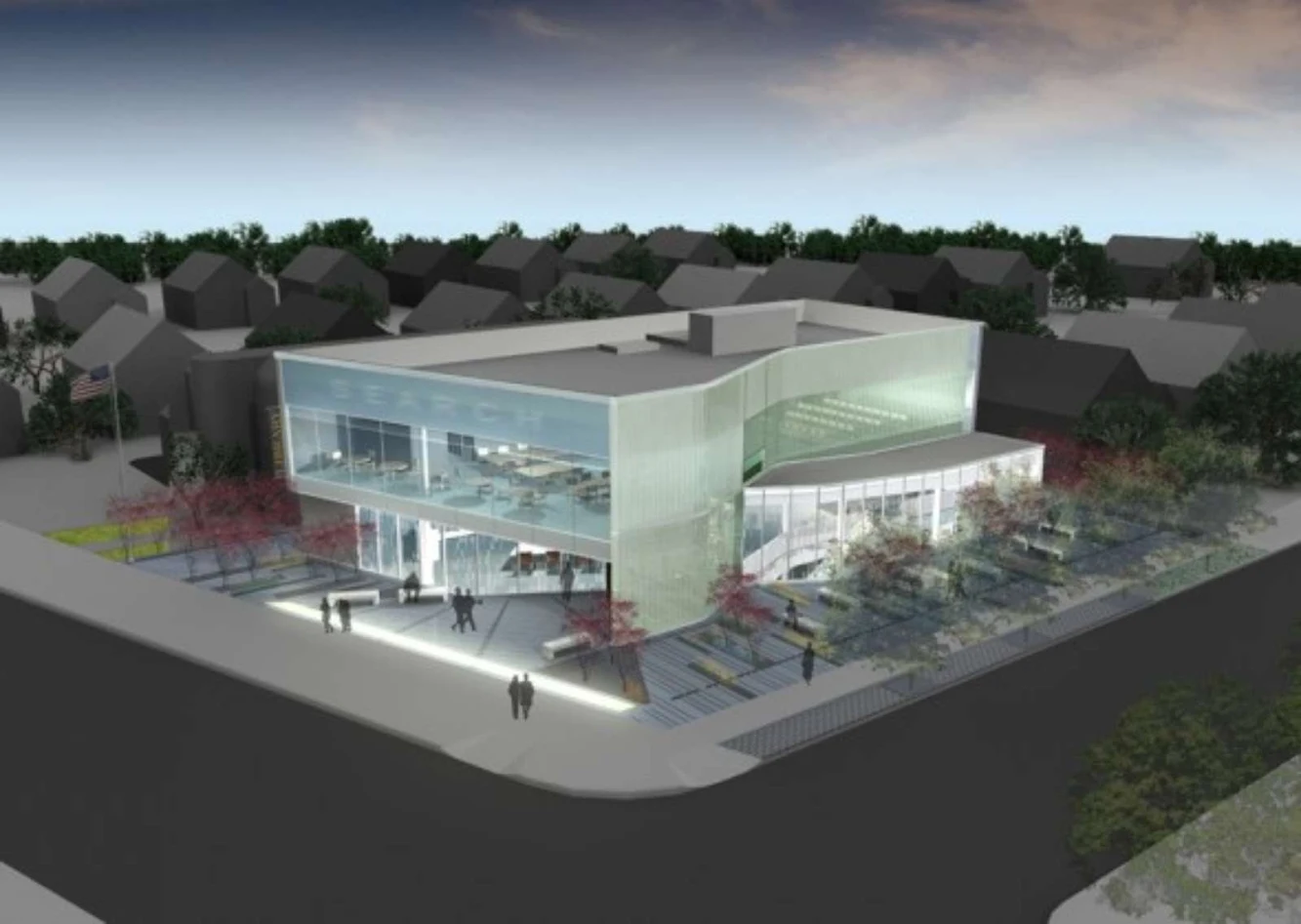
As the building area required is double that allowable by zoning, half of the interior spaces are placed below grade. A double-height space adjacent to the building entry and strip skylights in the plaza bring light through a contoured ceiling to define specific reading areas located below. the profile of the contoured ceiling is read at the double-height space, making a visual connection between the plaza and ceiling surfaces, accentuating the artificiality of the ground.

The landscape strategy acknowledges the ground surface’s dual role as an outdoor public space and its inversion as the roof of the cellar below, exploring the relationship between artifice and nature. Above grade massing and material treatment respond to differing site conditions on each elevation. A large picture window along the front elevation provides views into and out of the second floor children’s area, while providing a civic identity to the community. Exterior materials merge the scale of the library to Union Turnpike and the residential context.

The Queens Library serves over 2.2 million people from 63 branch library locations plus 6 Adult Learning Centers. It has one of the highest circulations of any library in the world. It is first in circulation in New York State since 1985 and has maintained the highest circulation of any city library since 1987. Glen Oaks Branch Library serves one of the most ethnically diverse communities in Queens with a population of just under 20,000 from over 50 countries speaking 29 different languages.

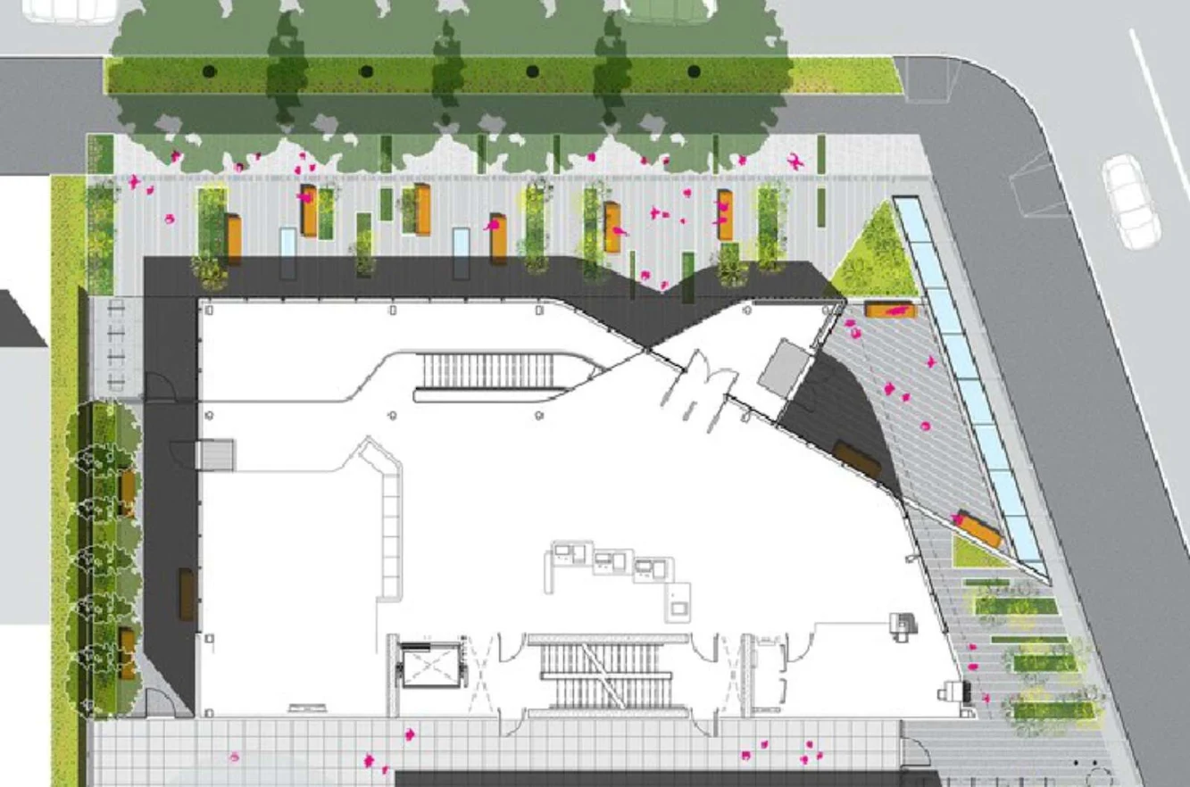
The landscape strategy takes into account the ground surface’s dual role as an outdoor public space and as the roof of the cellar below. Above, the landscape transforms the site constraint that allows for only a thin crust of soil into an opportunity to explore relationships between artifice and nature. Rather than propose large bulky planters that would block visual access into the library, the landscape architects propose a contiguous thin soil matrix under a field of bluestone.

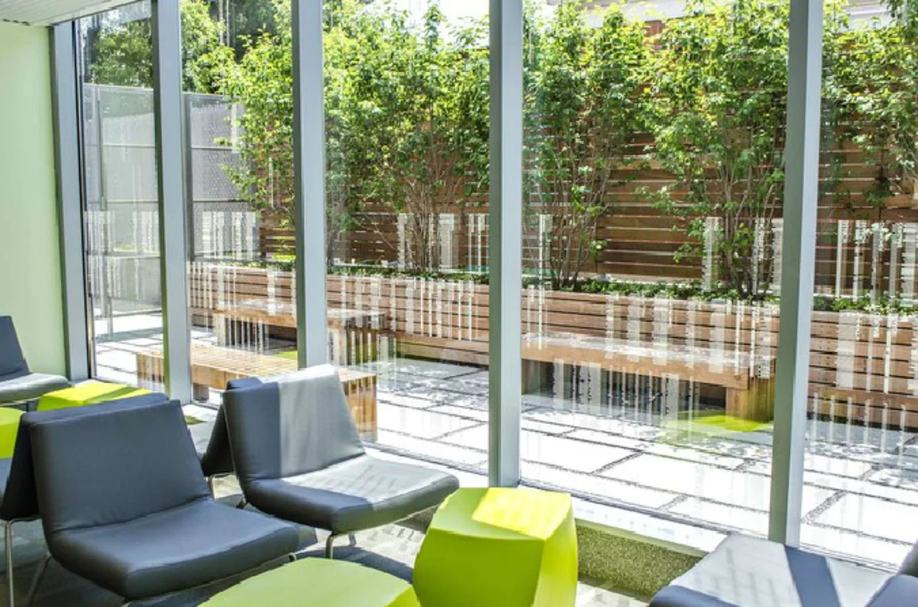
Rhus glabra, or Sumac, is planted bare-root in this contiguous but thin soil matrix. Sumac roots tend to be shallow and wide-spreading and therefore is highly suitable for this condition. Bluestone planks of varying widths create an urban surface in keeping with the library’s residential context and larger public space role and are ‘removed’ to plant Sumac and low perennials. Benches are introduced in keeping with the grain of the bluestone pattern, which splays at the building entry. the library landscape is porous visually, blending inside and outside, while providing quiet seating areas for rest and reading

As the lower level constitutes over 50% of the building program including the main adult reading room, creating a well-lit space below grade is of primary concern. A double-height space acts as a large skylight and connects the ground floor to the lower level. in addition, three strip skylights in the plaza bring light down to define more specific reading areas within the adult room. the ceiling of the adult reading room under the outdoor plaza is contoured to form varying heights above the finish floor, providing more intimate reading areas within the relatively open plan. the profile of the contoured ceiling is read at the double-height space, visually making the connection between the plaza surface and the ceiling surface and accentuating the artificiality of the ground.

The pattern on the graphic film interlayer on the lower level north and west elevation allow the building to be “read” at multiple scales: as an abstract pattern from the distance of the neighborhood that becomes, as the viewer moves into closer proximity, information about the multitude of languages spoken in Glen Oaks, represented through a pattern of book ends of varying colors. the pattern doubles as a screen to filter western sun, reducing heat loads in the summer months.

The north elevation functions as a picture-window view into and out of the second floor children’s area, while also satisfying the Library’s desire to provide a civic identity to the community. the word “search” is projected by the sunlight through letters in the film in the parapet onto the glass curtain wall, varying in scale and legibility as a result of the time of day, degree of sunlight, and season.

The east and south elevations provide an economical and contextually novel solution that merges the scale of the library and its residential adjacencies. Cement board panels are fastened with polished stainless steel discs that reflect surrounding houses and landscape creating the effect of a “low resolution” pixelated image of the neighborhood.


Location: Queens, New York, Usa Architects: Marble Fairbanks Project Team: Mallory Shure, Jake Nishimura, Eric Ng, Adam Marcus, Stacey Murphy, Katie Shima, Christopher Kroner, Andrew Colopy, Jane Lea, Darren Zhou, Jennifer Downey, Alexis Coir Landscape Architect: Scape - Kate Orff Mep Engineers: Plus Group, Plcc Structural Engineers: Buro Happold Geotechnical Engineers: Langan Engineering and Environmental Services, Elmwood Park Plumbing Contractor: Mar-Sal Plumbing, Ozone Park Hvac Contractor: Pen Enterprises, Inc. Electrical Contractor: Stasi Dallas Electrical Prime Contractor: Summit Construction Services Group Leed Specialist: Buro Happold Consulting Engineers Commissioning Agent: Horizon Engineering Associates Llp Building Area: 18,000 sf Cost: $16.5 million Year: 2013 Client: New York City Department of Design and Construction and Queens Borough Public Libraries Photographer: Eduard Hueber/Arch Photo