
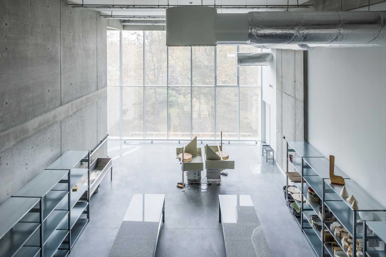
Creating proper space for artists and art was the main issue of the design. the solution is an open and accessible yet still practical space. Transparency of the building is the key solution for creating space for design process, art exhibitions and contact with urban trespassers.
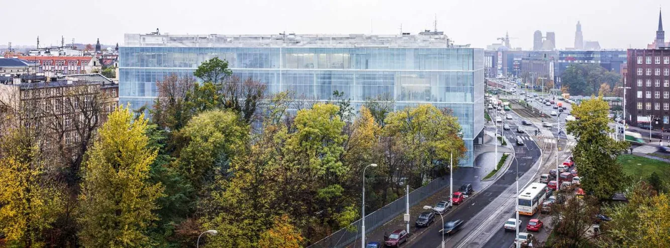
The new complex is supposed to consist of three stages – three wings combined and oriented towards existing garden. First stage of the development houses major laboratories, workshops and workspaces. the garden with its old grown trees remains the focal point of the development and the neighboring area.

Together with the new building they are meant to be an urban retreat for both users and guests and attract trespassers to interact with artists and their work.The building closes up the quarter along Traugutta Street, therefore it is also a cornerstone for the Spoleczny Plaza (Plac Społeczny) – an area that is being developed to become Wroclaw’s future bussines centre.

At the same time it closes and organizes space inside the Academy quarter, replacing and expanding old open-air studios. Simple yet expressive body of the building isolates the Xixth century quarter’s inner courtyard and the Academy’s garden. the most exposed part of the building – it’s gallery, at the intersection of the Krasinskiego Street and Traugutta Street creates – through a glass facade – unique opportunity of direct contact with the inhabitants of Wroclaw and thus shapes their views on contemporary art.

The gallery is an internal, separate exhibition space available from the pedestrian way and the inner quarter parking lot. in the future the whole side facade of the building along Krasinskiego Street will be equipped with a giant Led screen (invisible in daylight) for interactive student projects to be displayed.
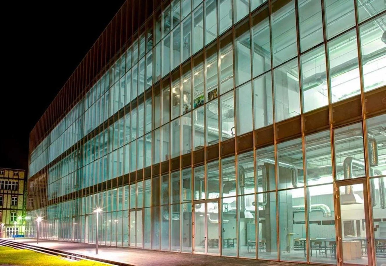
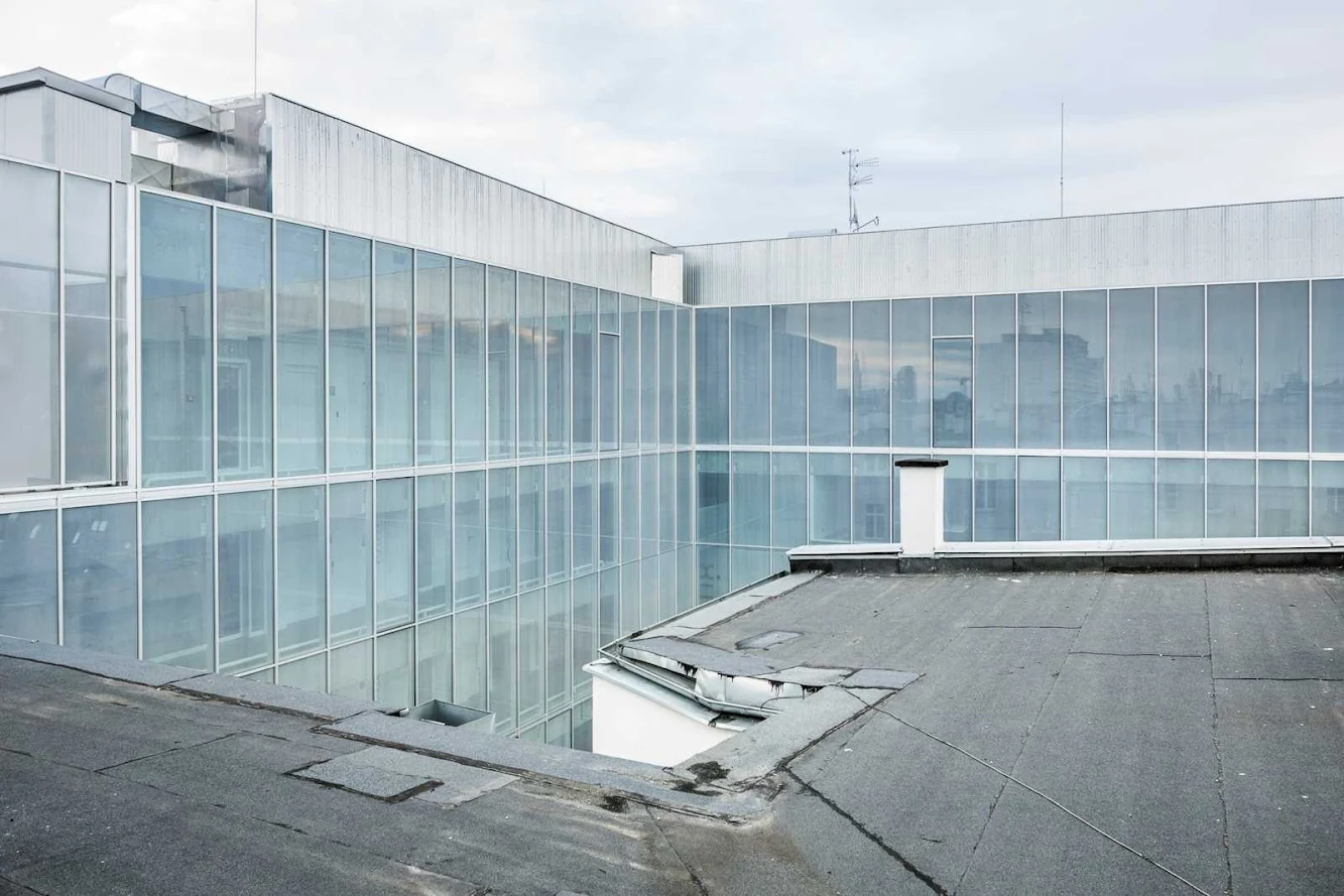
Facades the proposed glass facades provide maximum lighting for deep an high art studios. They also allow artists to integrate interiors of the studios with the outside green space. the entire glass facade is covered with white, matte, screen-printed paste. Thick, unified pattern on the first outside glass layer gives the entire block the effect of a milky impression and tenderness. Semi-transparent glass ensures acoustic isolation from a busy street yet does not limit interior lighting. Subtle divisions of the glass don’t disturb the feeling of lightness.
Functional layout the spatial arrangement of each floor is determined by the rhythm of five concrete structural shafts that enclose all vertical circulation (three evacuation staircases and three elevators shafts arranged alternately), main ventilation ducts and toilets. Horizontal communication on each floor above ground is provided by large corridors accessible both from elevators and staircases and galleries associated to studios.

On the underground level there is a garage for several vehicles. the floor also houses warehouse areas for sculpture, ceramics, design, and glass studios. the ground floor is divided into two independent parts by a drive through gate and entrance to underground parking. Part B is an independent gallery used to display works of artists from the Academy. the entrance to this part is set under a simple arcade on the corner of Traugutta and Krasinskiego streets. Main entrance to the building leads from the north, through a spacious hall, and also acts as a display area.

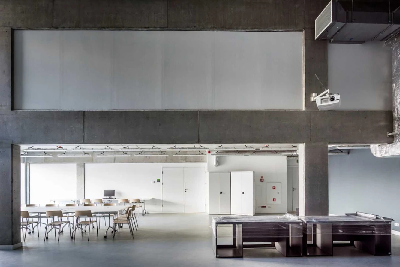
The hall leads to the main corridor that runs through the entire building adjacent to its west facade. Ground floor of 6.35m houses studios filled with heavy machinery: kilns, furnaces, welders. Above one side of the building there is a mezzanine suspended above ground- and each 2-storey-high floor. the mezzanine (second floor) consists of a corridor with an inside to the lower floor and a row of small rooms: storages, supply rooms, locker rooms, toilets etc. plus offices for the Academy staff (two per floor).

These rooms are deeper and, as mentioned above, hung over the gallery-corridor of the lower floor. the following floors repeat the staggered arrangement of the lower ones. the last sixth floor is partly obscured because of the nature of the work executed in its studios and has a small cafeteria with an access to a roof terrace with a view of Wroclaw. the building also houses an auditorium for 170 people with suitable foyer.



Location: Wrocław, Poland Architect: Pracownia Architektury Glowacki Project Team: Sylwester Duda, Agata Kaczmarek, Justyna Kleszcz, Michał Mrzewa Head of Design: Tomasz Głowacki Structure Engineer: Antonina Pawłowa Equipment: Teresa Maria Gudra, Wieńczysław Maryniak, Anna Nasiłowska Area: 13,060 sqm Year: 2012 Client: Academy of Fine Arts Wroclaw Photographs: Courtesy of Pracownia Architektury Glowacki