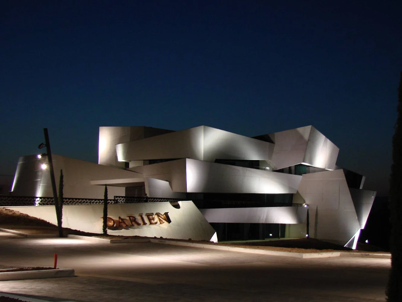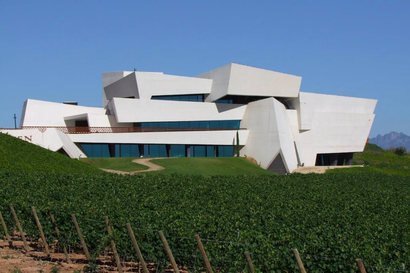
The inspiration sprang from the Rioja vineyards themselves “…where the succession of ridges and hillocks means that man has had to create an endless mesh of vines separated from each other by slopes and steep banks... from these banks emerge rocks, stones with sharp edges which have not yet been worn smooth by the wind.

Thus, continuing with this analogy, in the steep bank above the vineyard, from the hillock which overlooks it, the bodega rises up, appearing like a jagged wall of big boulders revolving around each other and letting past the light.

Between the blocks, between the faces, there are huge hidden panes of glass illuminating spaces and areas which are never conventional”.

The goal of design is to integrate the work with the landscape, blurring the boundaries. the building is not designed for mimicry, but as an allusion to the geography of the place.

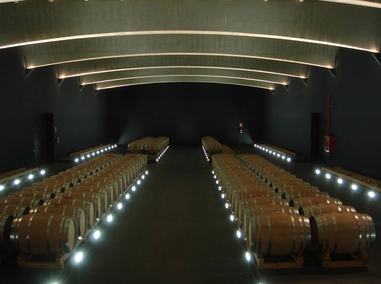
To achieve this, the building appears to be sinking into the ground, to cover and store wines and is open to the outside in areas that need light. Thus, most of the building appears buried, maintaining the continuity of the mantle of plants and striking a balance between thermal and acoustical.

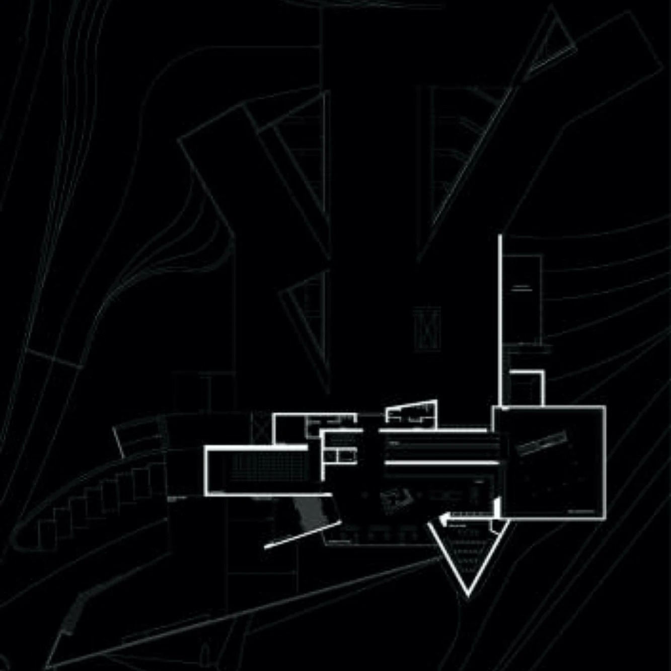
The building is designed in such a way to get the view of the vineyards. Formally, it causes a set of overlapping volumes. Straight lines and volumes, inspired by the vineyard itself, are used. It does not possess a single facade, but many different ones depending on the location of the observer. the work in 3 dimensions was key in the design.

Functionally, the winery meets certain requirements for wine making. in addition, the building houses a number of services ready for full use around the wine, because apart from the winery itself, it has a restaurant, a convention hall, a tasting room and work spaces designed for subsequent visits.

The cellars are buried. From the foyer there is a serene view over the vineyards and the valley of the Ebro, which contrasts with the apparent disarray of dimensions outside. the entries will cause light at the junction between volumes.

The entries of the light, forms and spaces, mixed and interconnected, provide a spatial continuity that flows carefully. Another area worth noting is the room - Museum of the History of Ceramics in La Rioja. This is a room designed and built specifically to house the collection. the idea was to achieve enlightenment in the parts of the collection, without casting a shadow over another and outlining the shapes of the vessels.

For this, two truncated pyramids overlap and allow the two gallery floors. the route on the outer mantle will discover the barrels were buried through the triangular skylights that emerge from the ground.


Location: Logroño (La Rioja), Spain Architect: Jesús Marino Pascual Constructor: Cnes. Cruz San Roman Area: 7.130,93 m2 Year: 2007 Promotor: Bodegas Darien, S.L.