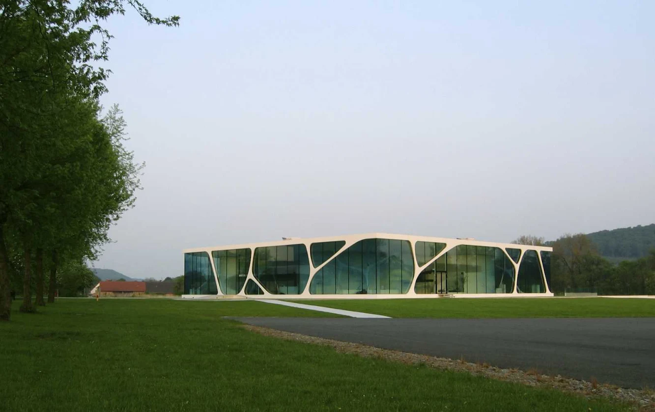
On the premises of the Westfalian company glaskoch who distributes glass products under the name 'Leonardo' a significant corporate architecture was created that now forms a central element in the brand's overall communicative presence.

As an atmospheric brandworld, the Leonardo Glass Cube conveys to guests and the staff alike the company's philosophy and visions in an inspiring manner. the open floor plan layout of the clearly designed and multi-functional Leonardo building enables an integrative linkage of product presentation zones, seminar and meeting rooms, inspiring work areas and a lot more besides across a total area of 1,200 square meters.

The glass façade of the building represents the passage to a hyper-naturalistic world with heightened aesthetic appeal. A transparent print slides into the insight or outlook as a subtly visible image plane. the graphically illustrated elements displayed on it were derived from the architecture and the surrounding landscape.

They create a subtle puzzle, mingling with the reflections of their models in reality. the edificial structure consists of two formally contrasting elements: A geometrically stringent, cube-like shell volume and a freeform positioned centrally in the interior.

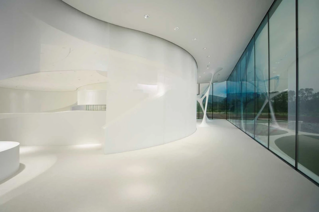
The undulating, curved white wall encases an introverted exhibition space and its other side circumscribes the extroverted hallway along the glass façade. Three white sculptural structures so-called 'Genetics' connect the separate zones of the building to each other again.

On the glass façade 'Genetics' appear again in a two-dimensional version. the superimposed pilaster strips are continued in a network of white concrete pathways that surrounds the entire building and lets it grow together with its location.

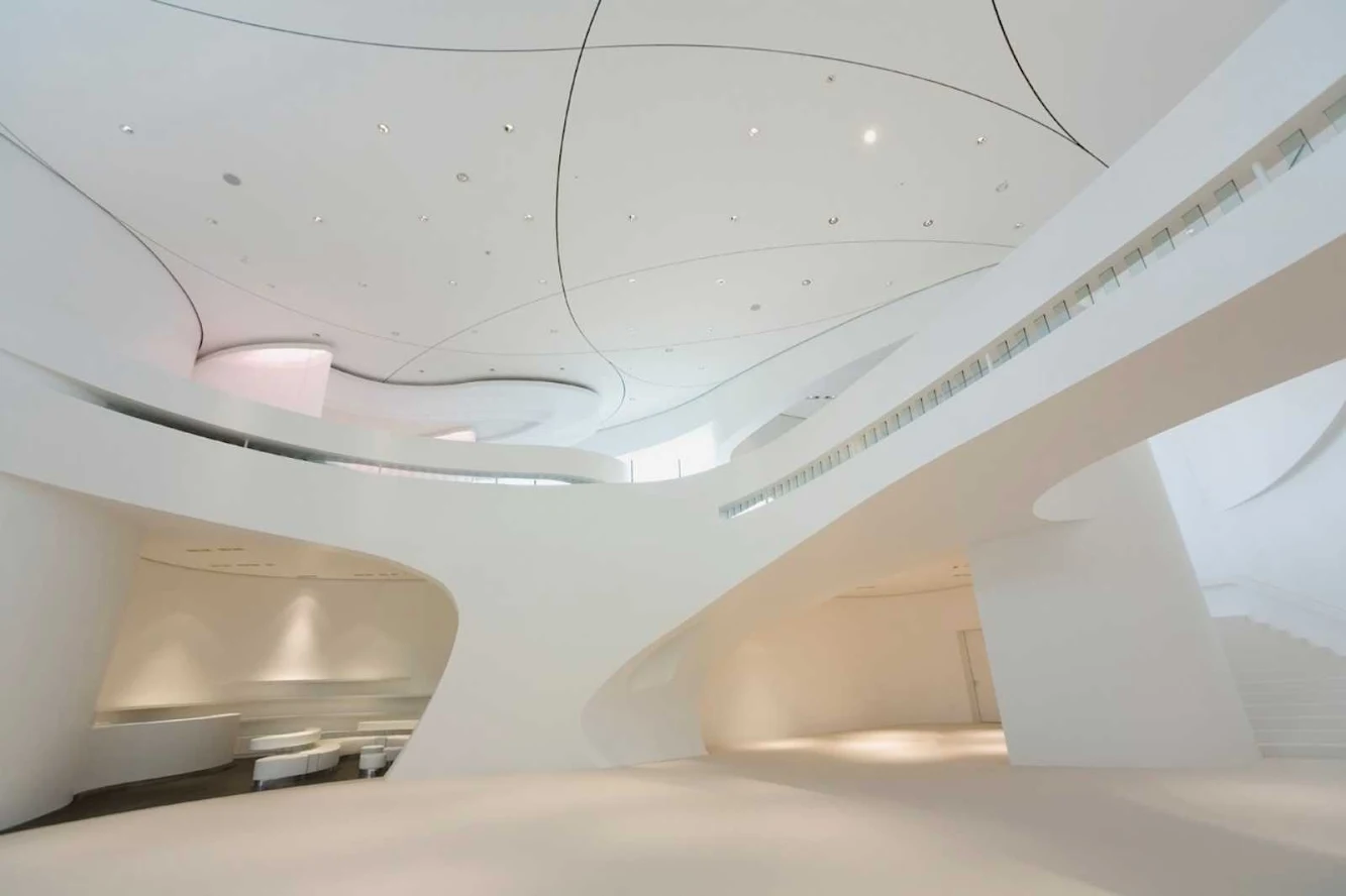
In the centre of the interior ground floor and basement are connected by a void crossed by bridges. Entering the Glass Cube through the ground-floor main entrance, visitors encounter a space that opens up not just horizontally, but also upwards and downwards.

On both floors the wall rolls in to form niches that are used for various functions such as themed product orchestrations and meeting lounges.

In particular in the breaks in the wall these lines predominate as a significant graphic design element that is continued on the ceiling as a system of ventilation joints. On the side facing the façade, the material nature of the white surface is visually dissolved by means of a layer of gauze suspended in front.

Dynamically programmed artificial light as well as the incidence of daylight sets colour highlights in the purely white interior and create a permanent change of atmosphere.


Location: Bad Driburg, Germany Architect: 3deluxe Area: 1,200 sq m Year: 2007 Client: Glaskoch Corporation