Located in the center of the city's cultural complex, the program for the Tel Aviv Museum of Art Amir Building posed an extraordinary architectural challenge: to resolve the tension between the tight, idiosyncratic triangular site and the museum's need for a series of large, neutral rectangular galleries.

The design for the Amir Building arises directly from the challenge of providing several floors of large, neutral, rectangular galleries within a tight, idiosyncratic, triangular site.

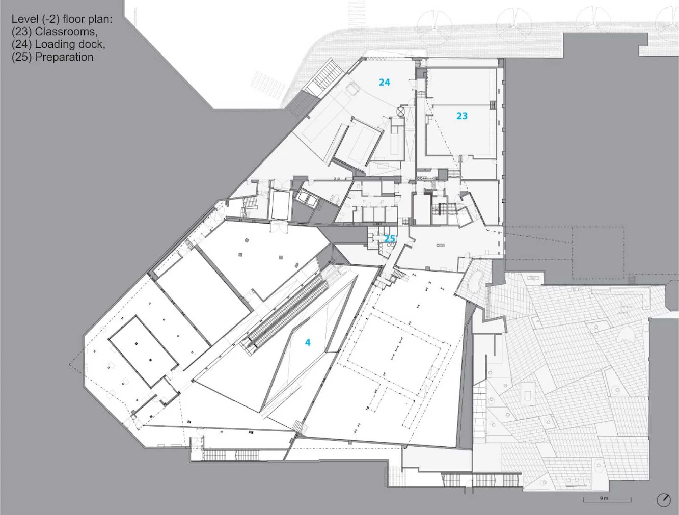
The solution is to “square the triangle” by constructing the levels on different axes, which deviate significantly from floor to floor. in essence, the building’s levels — three above grade and two below — are structurally independent plans stacked one on top of the other.

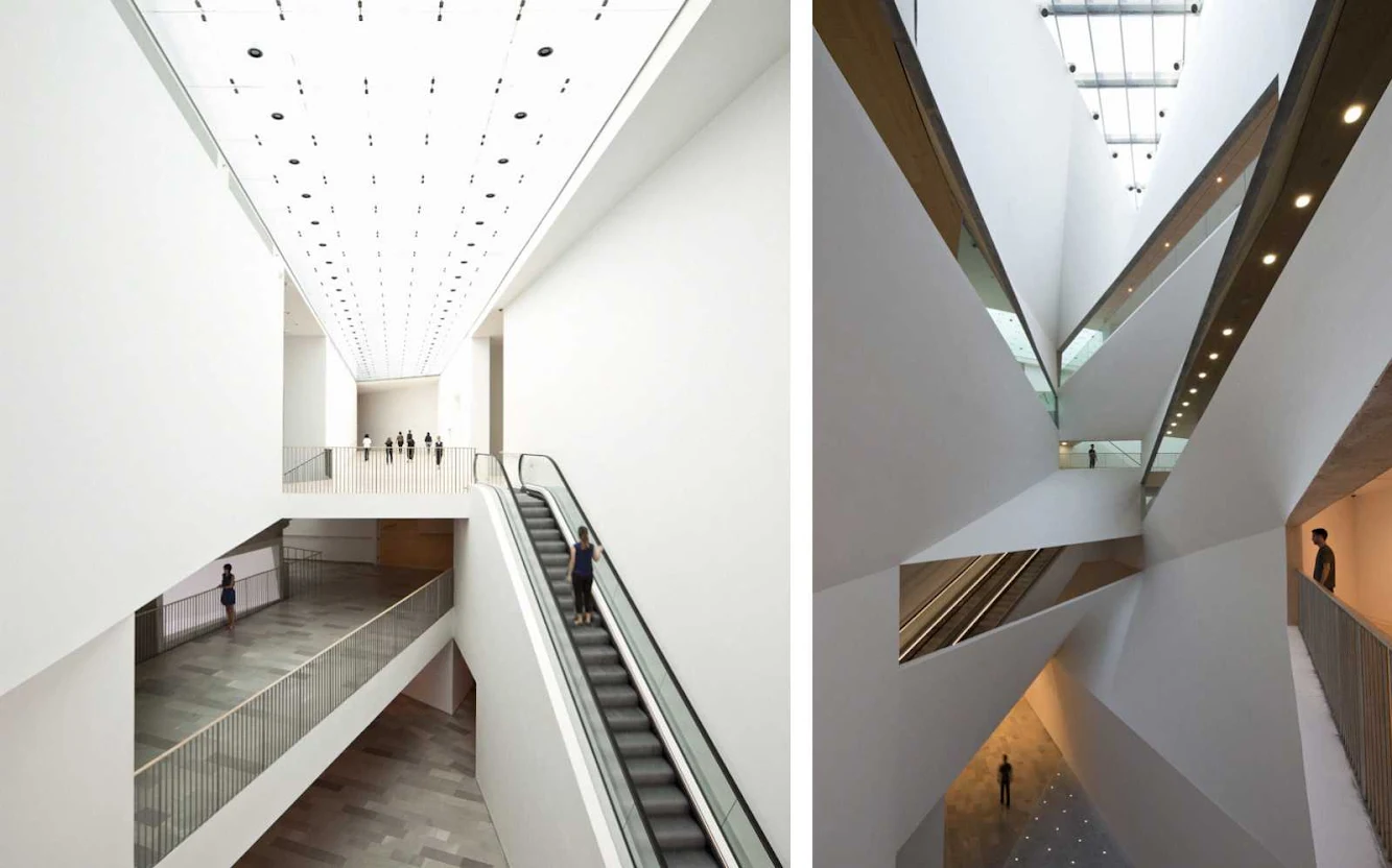
These levels are unified by the “Lightfall”: an 87-foot-high, spiraling, top-lit atrium, whose form is defined by subtly twisting surfaces that curve and veer up and down through the building.

The complex geometry of the Lightfall’s surfaces (hyperbolic parabolas) connect the disparate angles of the galleries; the stairs and ramped promenades along them serve as the surprising, continually unfolding vertical circulation system; while the natural light from above is refracted into the deepest recesses of the half-buried building.

Cantilevers accommodate the discrepancies between plans and provide overhangs at the perimeter. in this way, the Amir Bulding combines two seemingly irreconcilable paradigms of the contemporary art museum: the museum of neutral white boxes, which provides optimal, flexible space for the exhibition of art, and the museum of spectacle, which moves visitors and offers a remarkable social experience.

The Amir Building’s synthesis of radical and conventional geometries produces a new type of museum experience, one that is as rooted in the Baroque as it is in the Modern.

Conceptually, the Amir Building is related to the Museum’s Brutalist main building (completed 1971; Dan Eytan, architect). At the same time, it also relates to the larger tradition of Modern architecture in Tel Aviv, as seen in the multiple vocabularies of Mendelsohn, the Bauhaus and the White City.

The gleaming white parabolas of the façade are composed of 465 differently shaped flat panels made of pre-cast reinforced concrete. Achieving a combination of form and material that is unprecedented in the city, the façade translates Tel Aviv’s existing Modernism into a contemporary and progressive architectural language.

Housing an installation of the Museum’s comprehensive collection of Israeli art, as well as its architecture and design galleries, drawings and prints galleries, photography study center, art library, new auditorium, a large gallery for temporary exhibitions and public amenities, the Herta and Paul Amir Building is intended to create an outstanding, forward-looking work of architecture for the Municipality of Tel Aviv.


Location: Tel Aviv, Israel Architect: Preston Scott Cohen Project Team: Amit Nemlich, Tobias Nolte, Bohsung Kong, Steven Christensen, Guy Nahum, Gjergj Bakallbashi Competition Consultants: Ove Arup and Partners, Caroline Fitzgerald, Tom Dawes, Mark Walsh-Cooke Cost Estimator: Hanscomb Faithful and Gould Project Management: Cpm Construction Management Ltd. Structural Engineers: Yss Consulting Engineers Ltd. HVAC: M. Doron-I. Shahar and Co., Consulting Eng. Ltd. Lighting: Tillotson Design Associates Acoustics: M.G. Acoustical Consultants Ltd. Area: 18, 500 sqm Year: 2011 Client: Motti Omer, Director and Chief Curator Photo: Courtesy of Preston Scott Cohen